Showing posts with label design. Show all posts

2.02.2010

Maps and architecture and cities and me and an artist named Alice

I'm never sure how I get onto things, but at some point I found myself on this blog, which led me to one Alice Aycock's website. I thought some of her stuff looked really neat, and not just because she is using a grey background on her page and an awesome orangey-yellow colour for her main title. I'm also excited because her work ties in, however tangentially, with some of my interests in art, urban form, architecture, etc. that I've been reading and thinking about of late. (All the pictures I show below are from her website, where you can find more of her work and lots more information.)

Her stuff is farther down but first...

I recently finished this:
That is a drawing of a city. It's pencil on paper and as you can see my efforts at going over the lines were more aggressive in some parts than in others. I think I might do a series of these, maybe start inking them.

In my map I've largely blocked in spaces in terms of grass, concrete or water. There is also just a bit of detail (roof lines and some differentiation for docks) in some of the 'built' blocks. I've added some colour below so you can see what I'm talking about
For the most part, the areas without colour are human structures of one form or another.

This blocking is similar to how a Toronto mapmaker dealt with the problem of describing a city in 2-D from above. Leaving most blocks as blocks and restricting built detail to the ghosting of large institutional footprints. No little lines for house roofs in this one.
But then I came across this image on Aycock's site. What would I do for a building with a hat on?
Low Building With Dirt Roof (For Mary), 1973
I never considered how green roofs or any rooftop park would play in a map until I saw this picture. The traditional top-down view for maps works because things are simplified, often with the notion of single land use. But when there's a significant built park in a city, even if it's high in the air, it needs to be acknowledged. People following a 2-D map and finding a building where they expected green space would be surprised, so there needs to be differentiation of some type, whether it is colour, shape, labeling or something else.

And if I decided to take on a utopian mapping project (I quake even at the thought) I would need to consider the mixed land use that might be taking place on a very fine scale. Methinks I need to start drawing on bigger sheets of paper. More to follow on this theme, no doubt.
"The City of Walls", Isometric, 1978
The Garden of Scripts (Villandry), 1986
Maze, 1972
Walled Trench/Earth Platform/Center Pit, 1975
A Simple Network of Underground Wells and Tunnels, 1975
Project for a Circular Building with Narrow Ledges for Walking, 1976
I like these pieces because they are able to experiment with ideas of structure and architecture, without being concerned with eventual tenants. It's like she gets to play more freely with the signs and signifiers (pardon my weakness in semiotics) of architecture because she's building in farmers' fields. I'm sure she still takes human form into account, but unlike a 'proper' architect she has fewer restrictions. An architect must consider daily human use and if they don't think about how people will live in their built spaces, said spaces stand a good chance of failing.

Looking through the site, I'm definitely a bigger fan of her earlier work. She seems to focus more on architecture and structure than in her later stuff. Starting in the 80s her work begins to take on a more sculptural and decorative air. By decorative I mean there is less concern with function (as vague as it might be) and more with aesthetics. Her sculptures are still fantastic and full of use, it's just that the architecture that remains as a theme in some pieces is often more abstract and less obvious.

I'm always wary of venturing opinions on realms foreign to me (at least in writing, when speaking I venture insupportable opinions on things I know nothing about all the time). I worry I lack the vocabulary to express my notions accurately. Oh well. No offence intended anyone!
Functional and Fantasy Stair and Cyclone Fragment, 1996
And I'm not saying her sculpture is bad. Just that I like the themes she's exploring in her earlier work more.

If someone knows what I'm talking about, feel free to tell me.

Also, everyone should look at the artist's site. There are so many cool things there, even a machine that makes the world! In the meantime, play on this...
The Game of Flyers, 1980
Note at the bottom (that is here): I did an experiment and didn't promote the previous post. The results of the experiment tells me no one has looked at it. If you're interested, it's there and it's about food!

1.26.2010

the things I do

The idea was simple: volunteer a few hours at the Daily Bread Food Bank. Christmas is the time they receive the most donations so they have Public Food Sorts to help clear the backlog.

Food sorting on this scale is one of those activities that on the surface seems like it might be a bit dull, but once you're doing it, is actually fun. Tearing into donation bags, boxes, etc., categorizing the contents, packing a box and putting it on a trolley. Once the trolley is full all the boxes get barcodes and digitally scanned before being taken back to the warehouse. It's satisfying like Tetris is satisfying. And Tetris is satisfying.

After a morning of such excitement I could have taken the TTC home, but instead chose to walk. Daily Bread is on Islington and according to the internet it's a 10km walk home, but I inevitably meandered, doubled back a few times and made my stroll oh so much longer.

First step, walk away from the city!

Stupid? You ask. Nay! I say. How else am I going to get a good look at the GO/VIA rail yards?
That's the city, way over there.Fun fact: Canadian trains are multi-dimensional!
I didn't have any specific goals on my walk, just see some of the city I hadn't seen before, and walk along the waterfront for a time. Success on both fronts.

There's that city I live in.
I took a lot of skyline pictures. It's a view that takes in a lot at once, similar to my interest in birds-eye views or aerial photography, or maps even. Skyline shots that have a long, uninterrupted foreground (over water in this case) are like a sideways map or something.

There's one thing about photography (many things actually) that I haven't figured out. I see the city before me, humanity's hubris writ large, I see the sky and the water's changing tones, but I still don't know how to capture it. In my mind that's one of photography's unique abilities, to take an instant and hold it forever so that anyone who looks at the picture subsequently has at least an idea of what it might have been like. I get some of that in these, but not all that I want

I was really trying to treat the walk as one I would take in a foreign city, allowing myself amazement at every turn, paying attention to oddities and unique moments. But, I have to tell you, waiting for that water to splash into frame for the picture above damn near froze my fingers off.

After taking these pictures is when I found the goose head.
I don't know where the rest of him was, but the head looked fresh. I wandered off from here and walked a good 500m before thinking, HEY! I can use that goose head. After a brief internal debate I returned to hide it. I'll come back in June or July and hopefully my hastily constructed stone crypt will have done it's job. Keeping the goose's bones in one place, while allowing the buggy bugs to eat away all the flesh!

My taxidermically imagined creature is coming together, slowly but surely. I now have the turtle shell, two groundhog skulls (only one partial lower jaw) and hopefully soon this goose head and neck. That's a lot of heads so I'll need to think long and hard on how to use them. Two or three heads is always possible, but maybe some groundhog fangs in a goose's mouth would be fun. Geese have a wicked serrated edge along their beak, like so many little teeth, but no fangs. Vampires are big right now, so a fanged goose will probably be a hit with the kids.

When I doubled back for the goose it meant I had to recross a beach that was either reclaimed land or had been a dumping area for construction work or both. There were worn bricks strewn about and although I'd resisted the first time through, the second time... Well, I loaded up my backpack and regretted my decision for the rest of the walk.

You can hardly blame me though, they're pretty fun bricks.
Yet another example of what we lose when everything is made at a few big factories. No more small brick makers each with their distinct molds and palette drawn from the earth around them. Judging from the wear on some of these, quality standards might have varied a fair bit as well.

As you might expect, they are building condos along the waterfront. According to this picture, they provide the ultimate lifestyle for everyone!!! White and Nude!!! No wait, the ladies look like they're wearing bras or bikini tops. Still, this must be a swingers' community.


Just a piece of advice to any home buyer...consider the sun at different points of the day. Unless shadows mean nothing to you. In which case, just live in a hole.


I think there must have been some swimming pavilions or something here in decades past. I know some of the communities a bit further on (Mimico, etc.) originally were the summer getaways for Toronto's well to do. but judging by the cement pillars on the shoreline a lot of the space in between might have been taken up at some point.

That or there's an ancient civilization no one has been telling me about.

And one more thing condo developers. Just because you build a row of stupid buildings that all look stupid in their own unique way, doesn't mean you've created a diversity of style.
It still looks stupid.

Aesthetic opinions are great because there's no need to support them, or they are awful because you can't convince someone without a clue to change their mind.

Is anyone else really into that dead grass shade of brown you get when the temperature is below freezing but there's no snow on the ground? I think it's great (not all the time...maybe just when the sun's out).

Shortly after this the walking and the bricks and the not having eaten started to get to me and it became more one step after the other than glorying in the afternoon sun. By the time I stumbled my way through Parkdale and along Queen I was feeling a bit loopy. Fortunately we were having a communal potluck that night and delicious food was in abundance.

Feel free to send me suggestions for future walks and/or what I should do with my bricks. I left lots on the beach, so think big!

1.21.2010

Nothing to say here

I just wanted to say a couple of things here.

Thing number one:

I mentioned this the other day, but I actually saw my blog on an RSS feed today and it looks like NOT GOOD!

Ew.

Fancy pants formatting goes into each and every carefully crafted blog post. Your mother's text-photo-text-photo blog, with one stacked atop the other, this is not.

You lose context through an RSS aggregator.

I shudder to think what some of my triple set of photos look like. I'm thinking right now of my pseudo-toon post of a few weeks past, where the pursuit of an 80s model Buick was captured in the dimming light of a winter, Grey County sky. How does that look on RSS? I'm going to find out.

Be back soon...

Well, the pictures are still arrayed across the screen but they spread farther than they appear in my version. Also, the colours aren't there. The visual experience the blog provides is lost as both text and pictures float on a white background.

Finally you lose the text's specific formatting when not reading directly from the blog. The text interacts with the images, laid out in specific patterns or sometimes actually pointing at an image. My comment about Bhutan's king being handsome was accompanied by a row of arrows pointing at his enormous and obvious photo. In a reader, the arrows point at the row of text above, suggesting profanities or a loss for words? I'm not sure, but certainly nothing of the intended absurdity.

I'm not telling you how to surf the internet, just trying to make your online life better.
-----

Thing number two:

People from the following countries read my blog:
Canada
United States
Great Britain
Okay, that makes sense I know people in all these places.

Singapore
Sure! Someone has only come by once, but they stayed for 10 minutes or so. I hope they had fun.

Bhutan
I already knew that.
Malaysia
Hey, I've been there!
India
...okay?
Saudi Arabia
Pakistan
Ummm...

I don't really know how the internet works and all the visits from that final clumping only occurred once and lasted exactly no time (that would be 0'00"), but this is pretty great. I'm hoping to get Angola and at least one of the 'Stans (fingers crossed for Uzbekistan) in the next week.

But really, if I could get someone from the British Indian Ocean Territory
I would be a very happy man.

12.12.2009

subways and Fort York

Twitter is something else, eh guys?

I just sit here and everyone else finds links for me. It's great. I don't even know I want to find something until it appears. When it does I just have to write about it.

This go round we're talking architecture and public transit to start. We'll see where we end up.

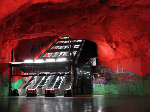
Designboom had a neat post the other day detailing the best subway architecture going. I will now commence moving some of their pictures over here, then adding my own limited commentary. This post is basically me giggling uncontrollably at neat things and wanting to share said giggles more fully than a simple link would allow.
Holy Stockholm Batman! The entire system is stuffed with artwork, and they have some great design features, including the hacked out of stone feel in a lot of stations.

I'm always a fan of mashing the hyper-future into unfinished and naturally riotous spaces. The notion bears a connection to my aesthetic appreciation for classical architecture and the modern; having a sleek, electric tram silently snaking through a centuries old city-centre or a new windmill silhouetted in the skyline beside an ancient, stone belfry.

Nice lights Munich.
The joys of building a system starting in 1972 and being able to incorporate what other cities have already learned.
This one reminds me of St. Clair West station in Toronto, which reminds me of a lot of Metro stations in Montreal (not that I've visited them particularly intensively). Both in the colours and in the high ceilings. I love how that mirrored ceiling makes the space last forever.

Tempo from St. Clair West station. It's nice, but not all encompassing like the above example. I understand that making the station itself into the art (or at least part of the art on display) can be more expensive and difficult, but with bigger risks come bigger rewards (sometimes).
I like the clean lines in this Bilbao station. Apparently the whole system and all its stations were designed byFoster + Partners.


Or this epilepsy inducing little number in Shanghai. Because this transit system is so short it's more about the sound and light display you experience than actually moving.

Check out the amazing texture on the wall in Prague.

And the opulence you can find in Moscow.
Just because I like the future combined with nature, doesn't mean having a straight-up future future future is now look is bad, like they have at Drassanes Station in Barcelona.
So what to take from all this?

Basically we need to be bold. I'm aware of economic restrictions, but you HAVE to be willing to spend money. Something like a subway station can't be changed after the fact terribly easily, so you have to get it right the first time (I don't mean get it right in the sense that a perfect solution can be found, but instead that we need to remember this is building the city for the next 40, 60, 100 years and to change a design to save $200 000 now might result in pain and bother for years to come). Spend the money and after the basic architecture requirements are met, turn it over to the artists, or even better have the artists and architects working together from the beginning.

As people move through a transit system everyday, their existence is at least partially defined by the spaces that they pass through. If you make those spaces big, bold and inspiring the people get something positive from it. Prioritize these spaces and invest in them.

If the people hate the art I'm willing to bet they're going to complain, and THAT's good too! Complaint leads to more discussion and more discussion leads to more change. Nothing about art or architecture is static and the next big project will be influenced by the last.

The key thing to remember - and probably also the most difficult thing to wrap your head around given the brief time-spans most people and governments operate on - is that each one of these projects is building towards an unseen city of the future. The infrastructure and groundwork we lay now is what will support the layers of urban citizenship that will arrive in forms unseen tomorrow. And in an even more perfect world the groundwork we lay now should also appreciate some of that which was built in the past. The city exists in time as much as it does space.

It's tough. Even the best conjecture lacks absolute certainty. The people trying to envision what is to come and build accordingly are going to receive all sorts of complaints around cost and style. Only years later will people be able to see the brilliance and foresight in what they built (think of the under-bridge subway line on the Bloor Viaduct. If that hadn't been a possible add-on in the original bridge design the entire subway system in Toronto would be vastly different, or at least have cost way more). And of course, some of the ideas won't pan out, giving all the naysayers something to point to.

Toronto did get a mention in the above article, Museum Station's redesign was considered cool enough for a comment.
And I agree. They did a good thing here. It is a retrofit but imagine the fun they could have had if designing this station from scratch, trying to capture the same themes and images. Oh boy!

-----

One more thing, non-subway, before I go.

Toronto is designing a new Fort York Visitor Centre. You can see the design proposals on Spacing Toronto. They're pretty neat and while I haven't passed judgement on any one, I recommend having a look at 4 first because its aerial view gives you a better idea of what's going on spatially.

This project interestingly connects to the previous post on the Gardiner Expressway. Fort York used to be right beside the lake. It's not anymore due to fill dumping and land extension, and is now wedged between the city and the Gardiner Expressway and the proposed visitor centre is actually going to exist at least in part beneath the elevated road.

As I said above, all these discussions on aesthetics are ongoing, with each piece adding to and elaborating previous physical opinions. Installing a fantastically designed visitor centre underneath the Gardiner brings together multiple eras, revealing both distinct moments of design (history, culture, society and everything) and how a moment in design-time lasts. Even after fashions change.

Just as a city's people move about and interact to provide its ever-changing social nature, a city's built aspects are not static. Each new piece of architecture reinterprets what is already there or was there before. Complete erasure (burying the Gardiner for instance) is not always feasible not necessarily desirable.

Given the Gardiner's decades-long role in Toronto and the lessons it has taught around prioritizing cars above people and neighbourhoods, re-interpreting it with more people friendly additions is a better way to go. As long as everything that gets built, no matter how avant-garde, remembers the person is the city's most important unit, it's difficult to really go wrong.

From pretty picture of train stations, to 200 year old forts and an expressway often called an eyesore, it's like a never-ending magical acid trip up in here.

10.01.2009

olympic clothing and provincial logos

HBC launched the Canadian uniform (outfit?) today for the upcoming Olympics. My thought, good.
I'm not going to say too much, just that I appreciate the aesthetic. If you're going to go for stereotypes you might as well go all the way.

Also, I appreciate the '80s styling, particularly on the toque. Childhood nostalgia? Probably, but who cares.
The other thing that caught my eye is the font, or more specifically the 'A'. It looks good. It reminded me of Alberta's recent decision that a unique stylized 'A' needed to be dumped in favour of an ugly, generic piece of script.

Whoever decided the Alberta logo needed to go just as it was reaching its pinnacle of retro chic needs to have their head examined. Similar to whoever thought dull, generic style would be a good idea to promote the province. Hey world! We're like everywhere else, only orange.

We were discussing this on Streem a few months ago and there seems to be a pattern. Look at Ontario's new trillium.
Meh anyone? I get it, if we work as a team we can be a better province. Very good. As Imran said, "It does lend credence to my theory that all modern day graphic design is done by 14-year-old Photoshop-proficient nephews of agency directors."

Just look here and try to tell me the older ones are not better. I think the green is the best, both in design and colour.
Alas. Governments in the '60s were bold and brave. Expo '67 and whatnot all said Canada was the future, we were going to change the world. It was reflected in legislation and the coolness of graphics too apparently.

And now? Governments are concerned less with governing and improving our lot with bold gestures, and more with surviving the next election. The result is boring genericism that aims not to offend anyone rather than take a risk and possibly inspire.